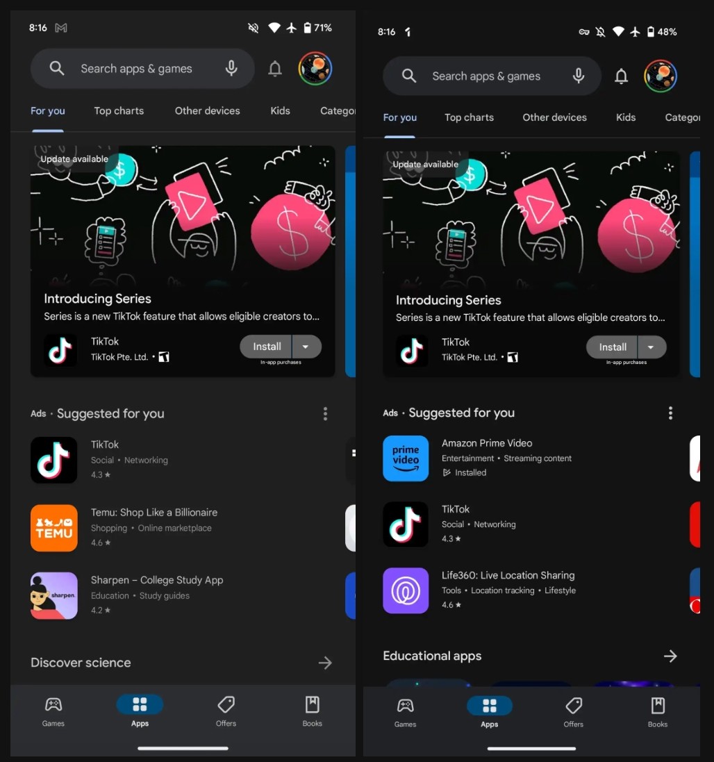
Google Play Store is reportedly testing a black theme across it’s pages, darker than the current grey shade theme.
The colour change also applies to the bottom bar but is slightly differentiated to identify the tiles. While there’s no word on when this could roll out to general users, Google may bring this one day, considering the community feedback, which liked the black theme on YouTube.
Black Theme on Play Store
Be it a website or an app, background themes are essential to the UI since they strongly influence the user experience. In this pursuit, many apps have introduced a dark theme in the past few years that feels light on users’ eyes in dark places.
Well, a better version of this is even darker – or a pitch-black theme, to entice more users. Google tested a black palette of such on YouTube last year and eventually rolled it out after positive feedback from the community.
Now, based on such experience, the company is testing a black theme for it’s Play Store too. As noted by 9to5Google, Google Play Store v37.0.22-29 is seen pushing a pitch-black theme, which is better than the current grey shade background.

This is a good change, especially for devices with AMOLED displays. The new black theme(Hex 131314) applies not just to the Play Store’s homepage but also to other sections like Settings, the four primary tabs of Manage apps & device and the app listings page.
The change also crawls to the bottom bar, although it’s slightly lighter to help users distinguish. While it’s a needed improvement, it’s unknown whether this darker shade will also apply to Dynamic Color-based dark themes. Also, since Google hasn’t confirmed these changes, we can’t hope that it comes ready for the stable version.
Other Trending News:- News


