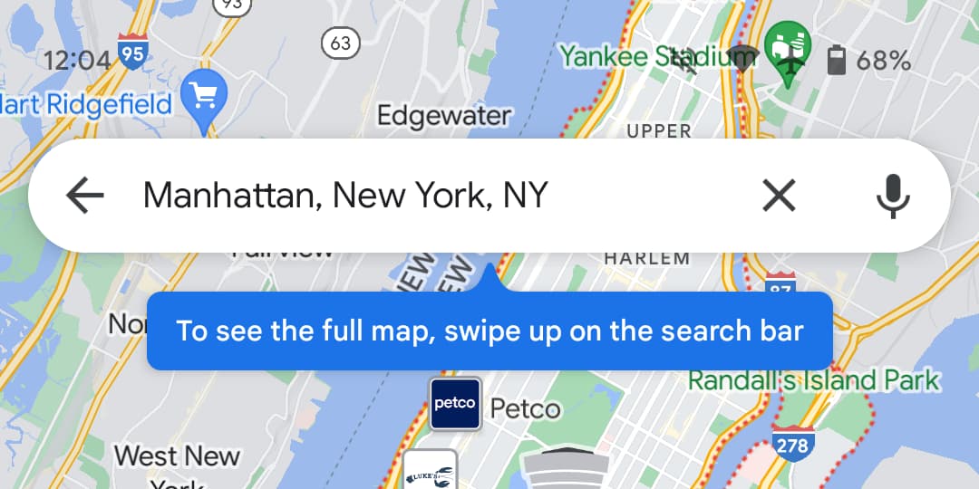
A new change to Google Maps this week means you can no longer tap on the Map to hide the search and bottom bar; instead, swipe up the elements to hide them for full view.
Though not intuitive, it’s better accurate than the current tap-to-hide mode. This has been in testing since February this year and has now rolled out to everyone on Android and iOS clients.
A New Way to Hide Maps UI Elements
Google Maps is one of the crucial services from G-suite that helps millions navigate to their destinations daily. With it’s vast data and advanced satellite connectivity, Google Maps is undoubtedly a needed product for everyone.
Thus, any change to Google Maps will be crucial to users. In this pursuit, Google is easing the way you can hide the UI elements on Maps – by swiping up the search bar to hide it, including the bottom bar. Earlier, it would help if you tapped somewhere blank on the map to hide them.

And this was a hassle if you’re looking at an urban area map and tapping on anywhere that selects a land object. Thus, to make it clear and quick, Google Maps allows users to swipe up on the search bar to hide them.
Though it’s not convincing yet, it made sense – as you’re interacting with different layers of details on Maps and tapping on a place would instead mistakenly select the object rather than hiding the UI elements.
Even in the new gesture, you should swipe up twice to hide the entire element. If Explore’s “Latest in [area]” sheet is peaking up from the bottom bar, a swipe will remove that UI, with another one required for all other UI. But when location listings are available, you only need to swipe up once.
Rumours about the tap gesture being removed first surfaced in February when some beta testers noted this change in the Google Maps Help forum. Months after, this change has now rolled out to everyone on Android and also for iOS clients.
Other Trending News:- News


